
Minimal
Less then 600 lines (17kb) of CSS code.
Quick Start
Zero compiling or installing necessary.
Mobile Friendly
Responsive and built with mobile devices in mind.
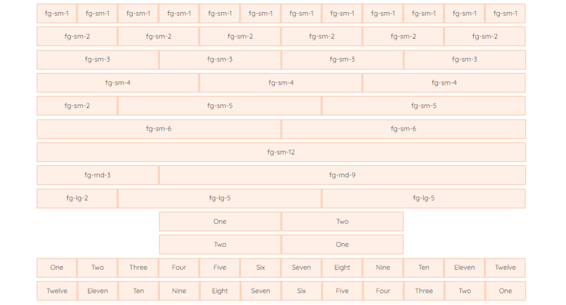
Flexgrid
Flexgrid is a responsive 12 column grid, with sizing classes available for elements spanning 1 through 12 columns, so you can easily mix and match column sizes. If you don't need all 12 columns, utility classes are included to center and/or reverse your columns.
Buttons
Buttons are available in 8 different verieties. Button styles are applied to a number of appropriate form elements, but can also be arbitrarily attached to anchors with a .button class.

Forms
Form element styles are included in bareBones.

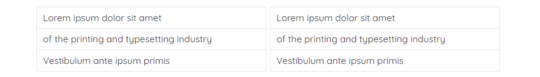
Lists

List Groups
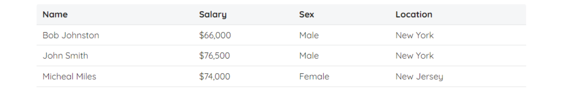
Tables
Be sure to properly code the table markup with <thead> and <tbody>.
Media Queries
Media Queries are used for styling your site across multiple devices. The queries are mobile-first, meaning they target min-width. All styles outside of a media query apply to all devices, then larger devices are targeted for enhancement. This helps prevent small devices from having to parse unused CSS.

Utility Classes
Included are a number of utility classes. Sometimes it's better to use a utility class than create a whole new CSS rule just to change the style of an element.

I work hard to provide PHP scripts & code that are user-friendly, responsive and free of bugs. If you find an issue with any of my scripts or code, please feel free to drop me a message. You can also help spead the word about bareBones by sharing it.